📬 Text to Image Ratio in Email Deliverability: Why It Still Matters
 Sergey Syerkin
Marketers love visuals. A single image can grab attention, simplify complex ideas, or convey emotion faster than text ever could. But when it comes to email deliverability, that love of imagery can backfire, if the text to image ratio is off.
Stay with me, and I'll unpack why this matters, what the ideal ratio is, and how to fix common mistakes.
💡 Key Takeaways
- Keep essential messaging in visible HTML text.
- Treat 60/40 as a heuristic, at least 60% text and no more than 40% images.
- Use appropriate image alternatives and test with images disabled.
- Balance design with readability.
- Assess placement alongside authentication, complaints, and reputation.
🧠 What Does Text to Image Ratio Mean?
In email design, the text to image ratio describes the proportion of written content and images in an email. You may also see this balance called the image-to-text ratio.
If your email is made up mostly of images, especially with very little readable text, spam filters (like Gmail’s, Yahoo’s, Outlook’s) may flag it as suspicious.
Why? Because spammers often use image-only emails to bypass keyword detection in spam filters. These filters now look for this tactic and penalize it.
Some filtering systems evaluate image-heavy content, but that does not establish a universal rule for inbox placement. Apache SpamAssassin's HTML rules include image and text ratio heuristics.
🚨 Why a Poor Ratio Hurts Your Deliverability
Here’s what happens when your email is too image-heavy:
- Spam filters can't “read” the message clearly, so for them it looks shady.
- When images do not display, readers may miss essential content or the action you want them to tak
- Image-heavy content can also create accessibility problems, so screen readers can’t interpret content.
- Triggers Gmail/Yahoo to assign lower sender reputation. (Tested and proved by myself)
Even a well-designed, beautifully branded image can land your message in the spam or promotions tab if it dominates your layout.
✅ What Is the Ideal Text to Image Ratio for Email?
There is no universal percentage that guarantees delivery. At least 60% text and no more than 40% images (the 60/40 rule) can serve as a design heuristic, but not a provider requirement.
Before sending, disable images and ask whether a reader can still understand the offer, its essential conditions, and the action to take. Check again at a narrow mobile width.
Google's sender guidelines provide delivery requirements and recommendations, but no universal text-to-image percentage.
🧩 Best Practices for Image Use in Email
- Keep essential copy in visible HTML text. A separate plain-text version is another representation of the message. Don’t rely on a single big image with all your messaging baked in. It does not make text embedded in an image readable when that image is blocked.
- Add alt text to all images. It helps with rendering, accessibility, and gives fallback context if image is blocked.
See the W3C Images Tutorial. - Use responsive image sizes for mobile usability and loading performance. Check the actual file size as well as the displayed dimensions.
Big, slow-loading images get you flagged, especially on mobile networks. - Avoid image-only CTAs (e.g., “Buy Now” as a graphic).
Always use HTML buttons or text links in addition to any graphic CTA. - Avoid relying on Base64 data-URI images in HTML. They increase encoded size, and support varies across email clients.
See RFC 2045 and Can I Email's compatibility tests. - Test your layout. Test with images on and off. Confirm that visible text and working links still communicate the offer and action.
Review spam diagnostics separately from placement observed in test accounts; a passing diagnostic does not guarantee delivery everywhere.
Use EmailConsul’s inbox placement test to see where your email lands across mailbox providers and review its SpamAssassin results.
📉 Illustrative Example: A Fashion Brand Email
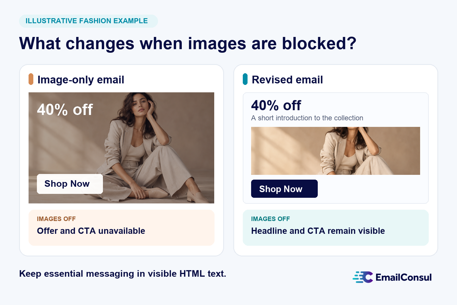
Illustrative example: A fashion brand sends an email with one large banner image containing a 40%-off headline, a model, a product photo, and a “Shop Now” CTA. If a reader cannot view the image, the offer and CTA are unavailable.
Revised version: The same brand uses an HTML headline, product photos with appropriate alternatives, a text-based CTA, and a short paragraph introducing the collection.
💡 Final Thought: Deliverability Is Balance
It’s not about eliminating images. Visuals are powerful. But in email marketing, form must serve function. Balance design with readability, and you’ll increase your chances of landing in the inbox – not the junk folder.
Remember: Spam filters are trained to mimic human judgment. If your email looks like something a scammer might send – image-heavy, no real content, no context – it’ll be treated accordingly.
📈 Want better results? Balance your ratio, test before sending, and keep your audience (and their inboxes) in mind.
If placement remains a problem after you improve the layout, review authentication, recipient complaints, and reputation before attributing it to the text to image ratio.
Want to learn more about EmailConsul?
Once your email is readable with images on or off, use EmailConsul to check inbox placement and SpamAssassin results before sending.